Simplified Scientific Plotting with the Chartly Python Package
By Azendae Popo (apopo@ec-intl.com)
Feb. 3, 2025
Scientific plots are essential tools for visualizing experimental data. These plots provide insights into the relationships between variables in a clear, graphical form. Over the years, technological advancements have introduced powerful computer programs that have transformed how we create these graphs.
Scientists can generate highly accurate and efficient visualizations using Python and Julia. These tools handle large datasets and support advanced features like 3D plotting and interactive visualizations. However, creating complex graphs often comes with a steep learning curve, which can be a barrier for new users.
Enter Chartly: Simplifying Plotting with Python
This is where Chartly comes in. Chartly is an open-source Python-based package designed to make plotting complex 2D graphs simple and intuitive. Developed under the Climate Modeling Alliance, Chartly is tailored to meet the needs of researchers and scientists working with climate and other datasets. Chartly eliminates the complexity traditionally associated with scientific plotting with its straightforward syntax.
A demonstration of Chartly’s simplicity:
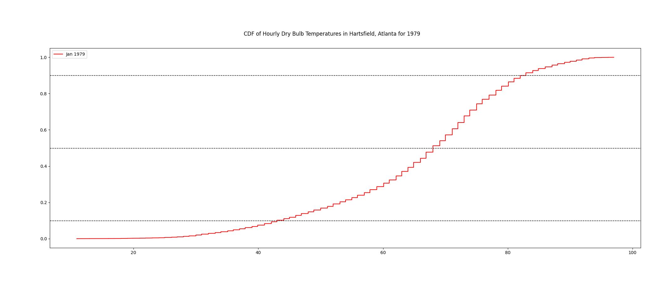
Imagine you want to plot a cumulative distribution function (CDF) of the hourly temperature in Hartsfield, Atlanta, for 1979. With Chartly, as shown below, you can accomplish this with significantly fewer lines of code compared to other Python libraries like Matplotlib, making your workflow faster and more efficient.
# Import Modules
import numpy as np
import pandas as pd
from chartly import chartly

# Extract Hourly Data
temp_data = pd.read_csv("atl_obs_data_1979-2023.csv")["DB"].values
atl_1979_hourly = temp_data[0 : 8760]

# With Chartly
plot = chartly.Chart({"super_title": "CDF of Hourly Dry Bulb Temperatures in Hartsfield, Atlanta for 1979"})
plot.new_subplot({"plot": "cdf", "data": atl_1979_hourly, "customs":{"color": "red"}, "axes_labels": {"linelabel": "Jan 1979"}})
plot()

# Without Chartly (using Matplotlib)
import matplotlib.pyplot as plt

fig, ax = plt.subplots(figsize=(20, 8))
x = np.sort(atl_1979_hourly)
y = np.cumsum(x) / np.sum(x)

ax.plot(x,y,linewidth=1.5,label="Jan 1979",color="red")

for hline in (0.1, 0.5, 0.9):
    ax.axhline(y=hline, color="black", linewidth=1, linestyle="dashed")
fig.suptitle("CDF of Hourly Dry Bulb Temperatures in Hartsfield, Atlanta for 1979")
plt.legend()
plt.show()
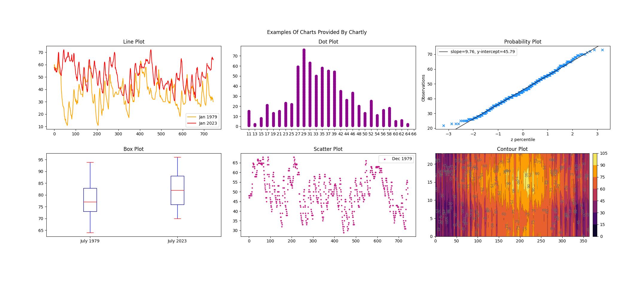
Chartly offers various plot types, as illustrated in Figure 2. Each plot can be created in its default form or customized by specifying preferences—Chartly’s documentation details all customization features and how to apply them.

One nascent and standout feature of Chartly is its distribution testing capability. This tool allows users to assess whether a dataset follows a normal distribution. Chartly can generate a normal distribution plot with just a few lines of code, providing visual and statistical insights into your data. We expect to augment this functionality with other statistical distributions.
Normal Distribution Test Plot
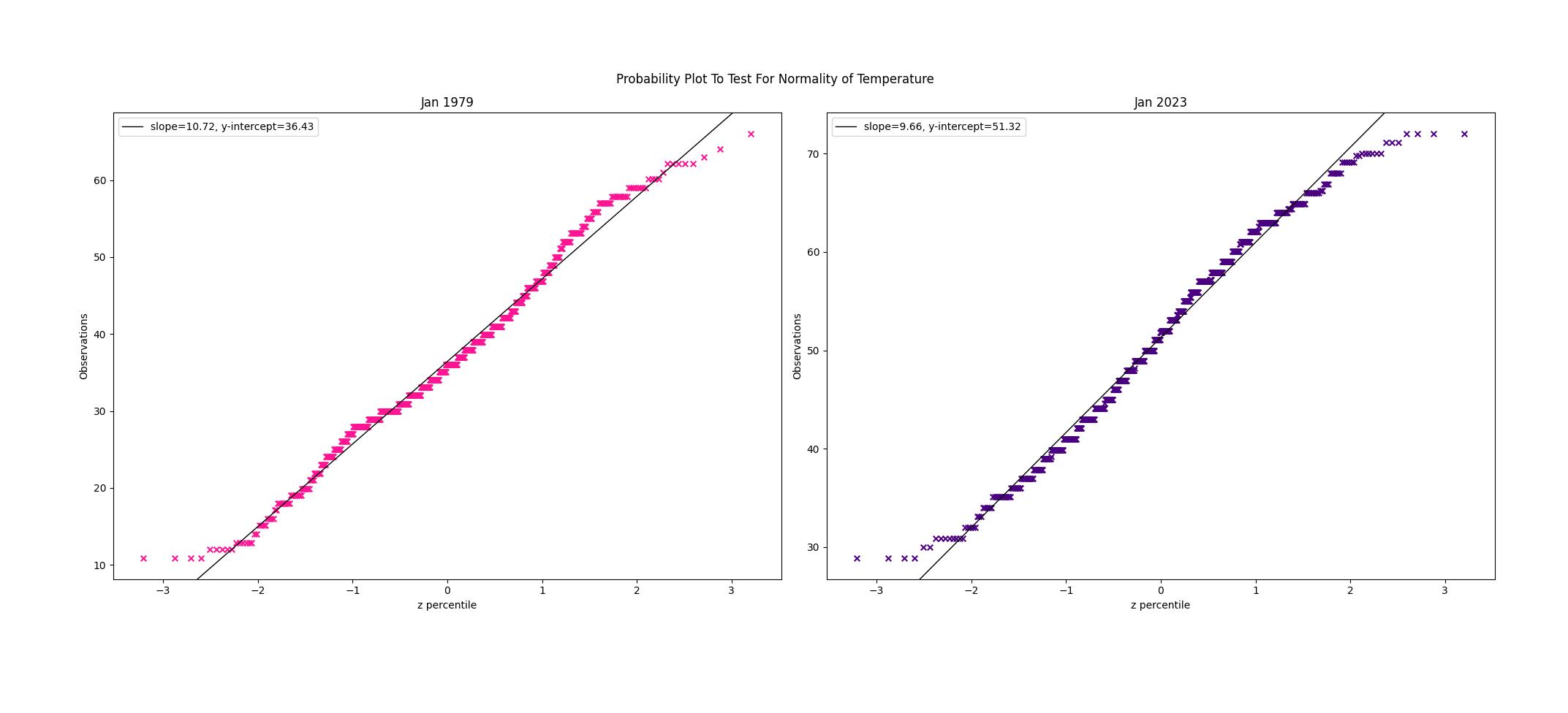
Imagine you are a researcher examining the distribution shape of hourly temperatures for a single month in 1979 and 2023. Using Chartly, you can create a probability plot to diagnose the data distribution, as illustrated in Figure 3. For the data to follow a normal distribution, the points should align closely with a best-fit line. Although the data for both 1979 and 2023 generally fit the best-fit line, the lighter tails indicate that the distribution of both datasets departs significantly from a normal distribution.
Why Choose Chartly?
- Ease of Use: Chartly’s readable syntax is perfect for beginners and experts alike.
- Efficiency: Create sophisticated visualizations without diving into complex coding.
- Specialized Features: Tools like distribution testing simplify data analysis.
Chartly bridges the gap between advanced plotting capabilities and user accessibility, making it an invaluable tool for scientists, researchers, and data analysts. Whether you're exploring your data or presenting your findings, Chartly helps to ensure your graphs are as impactful as your research.
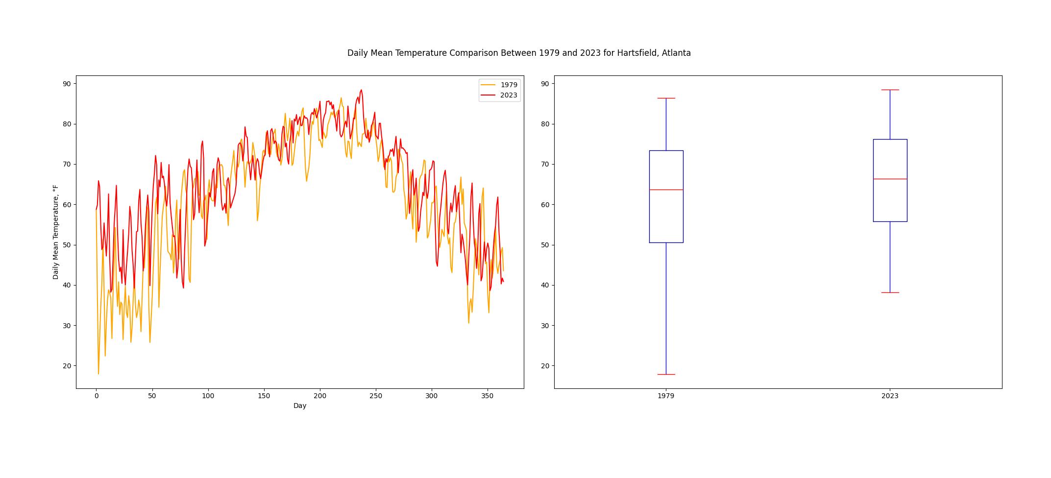
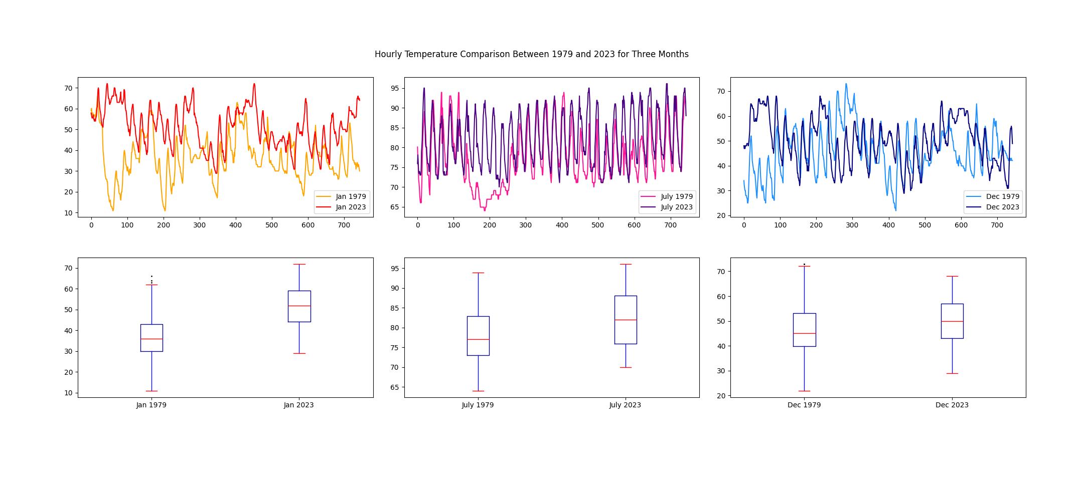
For example, imagine a researcher who aims to investigate how the temperatures in Hartsfield, Atlanta have changed over the past 4 decades. The mean daily temperatures for 1979 and 2023 are compared in Figure 4. Although noise makes identifying changes in the temperature trend challenging, the data suggests possible seasonal trends. This leads the researcher to compare the hourly temperature trends for January, July, and December, shown in Figure 5. It is clear that January 2023 is statistically distinguishable from January 1979, but December 1979 is harder to distinguish statistically from December 2023 (the PDFs show substantial overlap).
Get Started
We hope you try Chartly soon!
Installation
You can download Chartly from PyPI or by using the following command:
pip install chartly
Documentation
You can access our documentation here!
Collaboration
Chartly is open source, and we are thrilled to work with you! Developers can access our public Github repository here!